
📱 How to Make Your Website More Mobile Friendly?
Most people use their phones to search for businesses, products, services, and information. If your website is slow, difficult to read, or hard to use on a phone, visitors may simply leave.
That's why having a mobile-friendly website is important for every business today. The good news is that improving your website for mobile doesn't always have to be complicated.
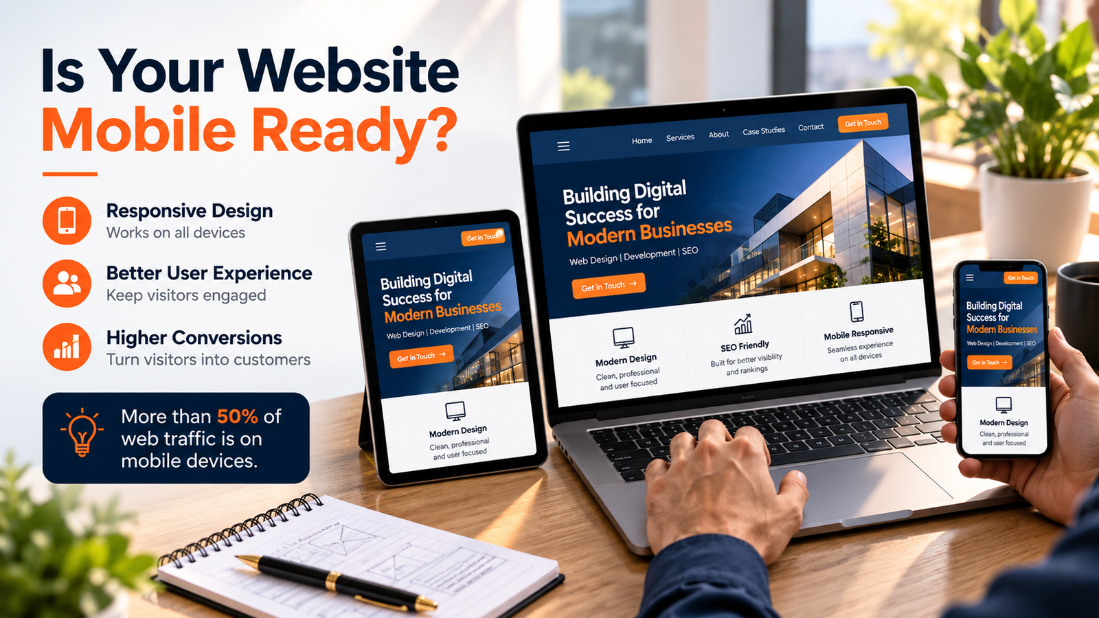
Source: Real Web
📱 What Is a Mobile-Friendly Website?
A mobile-friendly website is a website that works properly on smartphones and tablets. Everything should be easy to see, read, and use without unnecessary zooming or scrolling.
A good mobile-friendly website should:
- Fit properly on different screen sizes
- Have text that is easy to read
- Have buttons that are easy to tap
- Load quickly
- Have simple navigation
- Display images correctly
- Make forms easy to fill out
In simple terms, your website should feel comfortable and easy to use on a phone.
🌍 Why Is a Mobile-Friendly Website Important?
Imagine someone searches for your service on Google using their phone. They click your website, but the page takes too long to load or the content is difficult to read.
There is a good chance they will go back and visit another website.
A mobile-friendly website can help you:
- Give visitors a better experience
- Keep people on your website longer
- Make it easier to contact your business
- Generate more enquiries
- Improve online sales
- Support your SEO efforts
- Build trust with customers
1. Make Your Website Responsive
Your website should automatically adjust to different screen sizes. This is known as responsive web design.
A website may look great on a laptop but look completely different on a phone. With responsive design, your website can adjust itself for mobile phones, tablets, laptops, and desktop computers.
You don't need to create a completely different website for every device. A responsive website can adapt to the screen being used.
2. Make Your Website Load Faster
Nobody likes a slow website, especially when browsing from a phone.
Large images, too many plugins, videos, and unnecessary features can slow down your website.
You can improve website speed by:
- Compressing images
- Removing unnecessary plugins
- Reducing large files
- Using reliable hosting
- Keeping the website design simple
A faster website gives visitors a smoother experience and makes it easier for them to explore your business.
3. Use Easy-to-Read Text
Don't make visitors zoom in just to read your website.
Use a comfortable font size, enough spacing, and clear headings. Avoid very long paragraphs and break your content into smaller sections.
Simple formatting makes your content much easier to read while someone is scrolling through your website on a phone.
4. Make Buttons Easy to Tap
Remember that mobile users use their fingers instead of a mouse. Small buttons can be difficult to tap.
Important buttons should be large enough and have enough space around them.
- Call Now
- Contact Us
- Get a Quote
- Book Now
- Send Enquiry
Visitors should be able to tap these buttons without accidentally pressing something else.
5. Keep Your Menu Simple
A complicated menu can confuse mobile visitors. Keep your main navigation simple and show the most important pages first.
For most business websites, the main menu may include:
- Home
- About
- Services
- Products
- Blog
- Contact
Other pages can be placed inside the menu if needed. The main goal is to help visitors find what they need quickly.
6. Optimize Your Images
Images can make your website look attractive, but large image files can also make it slow.
Before uploading an image, reduce its size and compress it while keeping it looking good.
For example, if your website only needs a 1000-pixel image, there is usually no reason to upload a huge 5000-pixel version.
Optimized images can help your website load faster, especially for mobile visitors.
7. Don't Use Too Many Pop-Ups
Pop-ups can be useful for offers, enquiries, and newsletter sign-ups. But too many pop-ups can make a website frustrating to use.
This is even more noticeable on mobile because the screen is already small.
If you use pop-ups, keep them simple and make sure the close button is easy to find.
8. Keep Your Contact Form Simple
Nobody wants to fill out a long form on a phone.
Only ask for the information you really need. For example:
- Name
- Phone Number
- Message
Make sure the form fields are large enough and easy to use on mobile devices.
9. Make Your Phone Number Easy to Use
If you run a business, make it easy for customers to contact you from their phones.
Your phone number should be easy to find and, whenever appropriate, clickable so visitors can quickly start a call.
You can also add clear buttons such as:
- Call Now
- WhatsApp Us
- Send Enquiry
The fewer steps a customer needs to take, the easier it is for them to contact your business.
10. Avoid Horizontal Scrolling
Open your website on your phone and check whether everything fits properly on the screen.
If you have to move the screen left and right to read the content, your website may have a mobile layout problem.
Your website should fit the width of the phone screen, allowing visitors to scroll mainly up and down.
11. Don't Just Make Your Desktop Website Smaller
A mobile-friendly website shouldn't simply be a smaller version of your desktop website.
Think about what mobile visitors need first. They may want to quickly know:
- What do you offer?
- How much does it cost?
- Where are you located?
- How can I contact you?
Make this information easy to find without making visitors search through several pages.
12. Test Your Website on Your Phone
One of the easiest things you can do is simply open your website on your own phone.
Check the following:
- Is the text easy to read?
- Can you use the menu easily?
- Are the buttons easy to tap?
- Does the contact form work?
- Can you find the phone number?
- Do the images look correct?
- Does the website load quickly?
Don't only test your website on a computer. Your customers may be using completely different devices.
13. Keep Mobile SEO in Mind
A mobile-friendly website can also support your SEO efforts.
Make sure your website has:
- Useful and original content
- Clear headings
- Proper page titles
- Optimized images
- Internal links
- Good loading speed
- Responsive design
But don't write content only for search engines. Write for people first. Your content should be useful and easy to understand.
14. Keep the Design Simple
You don't need lots of animations and effects to make a website look professional.
A simple website can often provide a better experience, especially on mobile.
- Use clear headings
- Give your content enough space
- Keep navigation simple
- Use easy-to-see buttons
- Choose clean and useful images
- Keep text easy to read
Before adding a new feature, ask yourself: Will this make the website easier for my customer to use?
15. Check Your Website Regularly
Your website can change over time. You may add new pages, plugins, images, forms, or other features.
These changes can sometimes create problems on mobile.
So, check your website regularly from a phone. Even a few minutes of checking can help you find problems before your customers do.
✅ Simple Mobile-Friendly Website Checklist
- ✓ Website works properly on mobile
- ✓ Text is easy to read
- ✓ Buttons are easy to tap
- ✓ Menu is simple
- ✓ Images are optimized
- ✓ Website loads quickly
- ✓ Forms are easy to fill out
- ✓ Phone number is easy to find
- ✓ There is no unnecessary horizontal scrolling
- ✓ Pop-ups don't block the screen
- ✓ Important pages work properly
🧾 Final Thoughts
Making your website mobile friendly doesn't have to be complicated.
Start with the basics. Make your website fast, simple, easy to read, and easy to use.
Then test it yourself on a phone. Look at your website like a first-time customer. Can you quickly understand what the business does? Can you find what you're looking for? Can you contact the business without any hassle?
If the answer is no, it's probably time to improve your mobile experience.
A better mobile website can give visitors a smoother experience and make it easier for them to explore your services, contact your business, or make a purchase.
🚀 Need a Mobile-Friendly Website?
Design Global Technology helps businesses create responsive websites, landing pages, and website redesigns that work smoothly on mobile, tablet, and desktop.
📲 Contact Now